Features • Layout Design for Cottage Life
Designing select features provided a great opportunity for me to work with various collaborators to help tell a unique visual story across several spreads of the magazine. I art directed several photo shoots, both on location in cottage country and in studio. With a background in Biology and Biodiversity, I was the go-to Designer for nature features. Using my knowledge of the natural environment, I guided illustrators from rough concepts through to finished artwork that enabled readers to identify species while still enjoying the whimsy that only good illustrations can achieve. My experience with packaging and 3D design lent itself well to designing several project features and art directing technical illustrators towards the development of highly detailed project plans. Working on these features not only brought the fun challenge of visually representing seasonally specific content for the reader, but also helping to set the tone of the issue as a whole.
Knowledge: Art Direction, Layout Design, Information Design
Programs: Adobe InDesign, Adobe Illustrator, Adobe Photoshop
Details: Feature stories completed for Cottage Life Magazine
Award: AWARD OF MERIT for Art Direction of a Single Story 35,000 or more circulation: “Skip the House, Buy the Cottage" (by Michelle Kenny and Kim Zagar), was given in October 2019 by the International Regional Magazine Association.
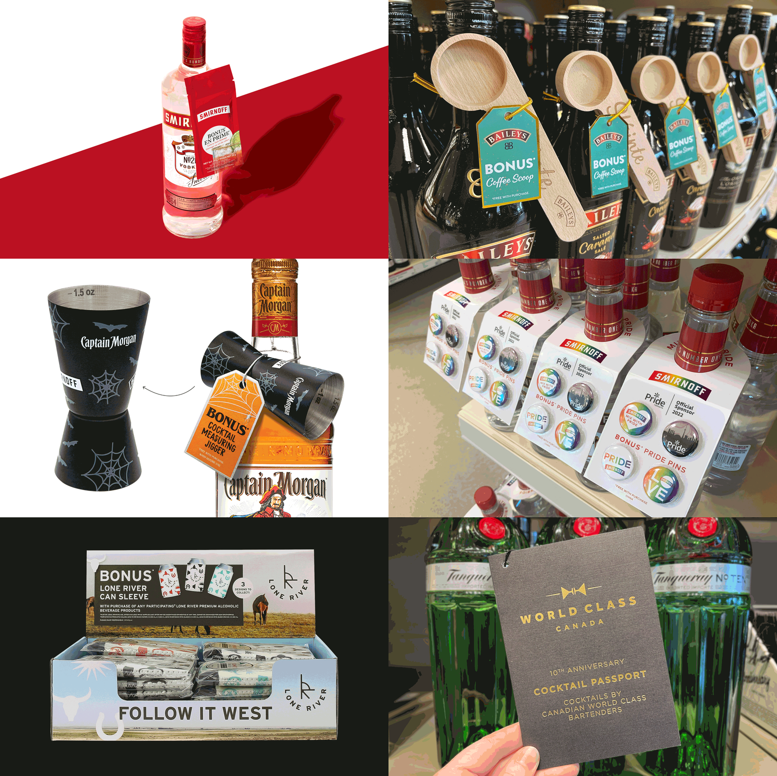
Value Adds • Retail Print and Item Design for Diageo
Diageo Canada aims to be the most trusted Consumer Packaged Goods Company in Canada. Such a lofty ambition is based on performance and developing trust with consumers. Diageo’s Customer Marketing Managers, in close collaboration with the Creative Team, were tasked with the development of National Below The Line (BTL) programming that enables customers to win at the moment of choice.
As the Creative Lead for Diageo Canada, I embraced branding requirements and designed items, print creative and packaging, to add value to existing Diageo products. Embracing customer insights, BTL programs were aimed at exciting the shopper to increase the likelihood of purchase by offering many deluxe, fun, or useful branded goods and supportive packaging.
All creative elements were designed on time for national and regional program execution, often supporting important events/holidays such as Pride Month, World Class Competition, St. Patrick’s Day, Cinco de Mayo, Christmas, Diwali, Asian New Year, and more. My experience with packaging and layout design lent itself well to reimagining blank die lines into well-branded vessels, conveying value and desire for the customer’s consideration. The quality and appeal of the “Free with Purchase” packages were sure to tempt shoppers, with the winning choice being to purchase one of the several Diageo Brand products as accompanied by it’s supporting value add.
Knowledge: Art Direction, Branding, Layout Design, Package Design
Programs: Adobe Illustrator, Adobe Photoshop, Adobe InDesign
Details: Branded value adds designed for Diageo Canada
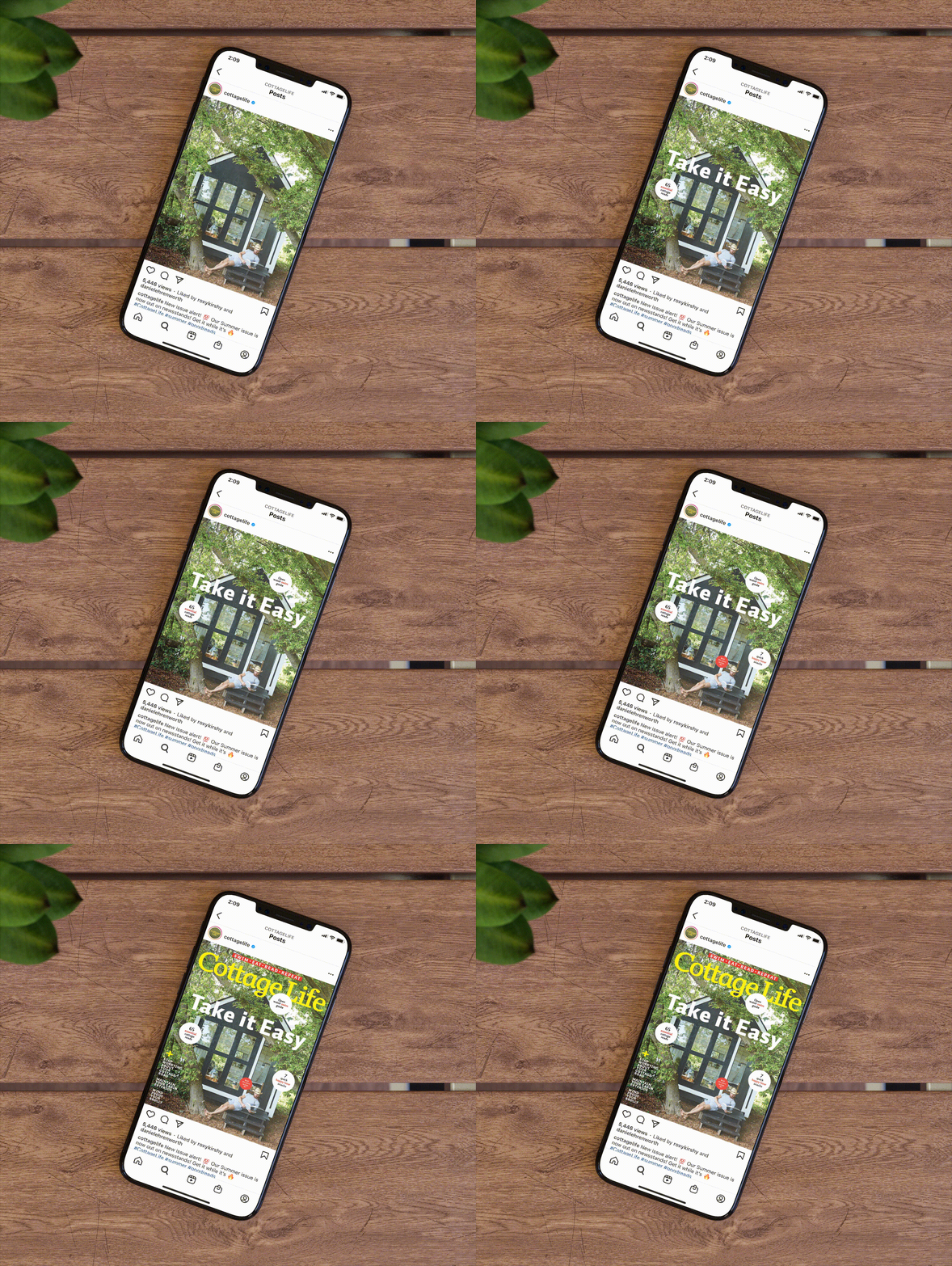
Animated Covers • Social Media for Cottage Life
In an effort to increase the presence of the Cottage Life brand on social platforms, I worked to digitally showcase the covers of the newly released issues. Using the print version as a starting point, I enhanced the digital covers with animation techniques and exported them as GIFs. The animated covers needed to remain visually similar to the print covers at first glance, so that they’d be easily identifiable to readers; however the motion design added a touch of whimsy, delight, and reveal that could only be accomplished through a digital medium. The animated covers were posted on Instagram, Facebook, and Twitter, and invigorated the CL brand’s social campaign.
Knowledge: Motion Graphic Design, Social Media & Digital Assets Design
Programs: Adobe Photoshop, Adobe Premiere, Adobe After Effects
Social Media Platforms: Instagram, Facebook
Details: Social media animated covers completed for Cottage Life Magazine
Digital Design • Website, Mobile Ads, & Social Media Content
Heather & Thistle creates bespoke flower arrangements for in-store purchase and special occasions. Their floral designers take extra care to select locally grown varietals and unique vessels to create statement pieces that are overflowing with blooms. The arrangements are inspired by nature—always unique, with whimsical colour palettes and uncontrived shapes.
The brand was designed to align with the shoppe’s philosophy, and it is reflected across the website (currently under iteration) and digital advertisements (yet to be published). I embraced user experience design concepts to make it easier for the customer to visit the website via the digital ads by using effective marketing, messaging and clear calls-to-action.
Knowledge: Ui/Ux Design, Digital Design, Wireframing, Branding
Programs: Adobe Illustrator, Adobe Photoshop, Adobe InDesign, Figma
Details: Client work that has yet to be published
Happy Seeds Gardening Kit • Branding and Package Design
The mission of the Happy Seeds brand is to introduce kids to the joy of growing their own food. Sustainable packaging, healthy eating, and community building are key lessons derived from the product. This project resulted in the design, assembly, and production of an environmentally friendly kit for children interested in urban gardening.
Logo and Brand Identity
Designing for kids was a fun and unique branding challenge. After research on the target market of children aged 7 to 11 years, I took careful consideration during the design process. To make the Happy Seeds brand feel instantly relatable and approachable to kids, I created an illustrated “happy seed” character, which was a prominent part of the logo. This character is paired with a fun rounded sans serif typeface in the logo, adding a level of personality and “happiness” to the brand. Bright colours are used in the package collateral, with a focus on shades of the primary colours (red, yellow, and blue), which are attention-grabbing and exciting for young gardeners. Though the brand, graphics, typography, and other design elements needed to appeal to children, this project and its mission also appeals to parents, who would purchase the kit.
Package Design
Other than fresh soil and water, the gardening kit contains all elements needed to successfully grow herbs and veggies—and maintain the child’s interest during the process. The package is the product, and all interior components serve one or more purposes towards the goal of achieving a small vegetable harvest. I took careful consideration during the design of the kit components, which include: cutting board lid, planter box, illustrated seed packages, information booklet/interactive poster, seedling markers, friendship pendants, recipe cards, seed-paper harvest invitations, and more. The simple all-in-one design of the package appeals to both parents and kids.
Knowledge: Brand Identity, Logo Design, Package Design, Illustration, Poster Design
Programs: Adobe Illustrator, Adobe Photoshop, Adobe InDesign
Details: Student project work for the York/Sheridan Program in Design (YSDN)
Award: Adobe Design Achievement Awards 2015 Semifinalist in the Packaging Category, was given in July 2015 by Adobe and Ico-D.
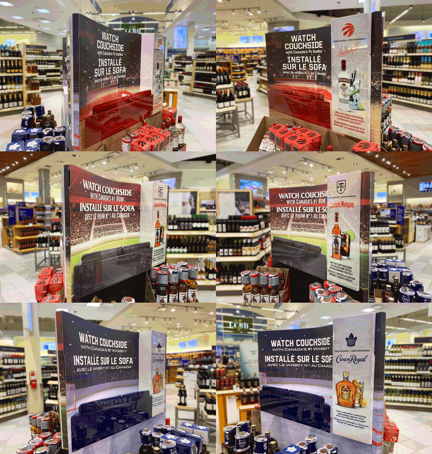
Point of Purchase • In-Store Display Design for Diageo
Diageo is a worldwide leader in the Spirits, Beer and Ready-to-Drink categories of the alcohol and beverage industry. Owning many globally recognized brands, a few include: Baileys, Captain Morgan, Crown Royal, Don Julio, Guinness, Johnnie Walker, Smirnoff, and Tanqueray.
As the Lead Graphic Designer for Diageo Canada, I co-ordinated with Customer Marketing Managers and Marketing Services Businesses, ensuring the successful completion of project deliverables while meeting deadlines and budgets. Prior to starting or assigning any design project, I reviewed all die lines and provided critical feedback to be communicated to vendors, preventing complex production issues. I played a vital role in the design and development of Below The Line (BTL) branded creative elements, such as in-store displays.
I ensured that respective brand strategies were accurately represented in the design of retail displays and other customer focused experiential environments. Point of purchase in-store displays were utilized in National BTL programs to improve Diageo’s brand visibility at points of shopper engagement. Often placed at the ends of aisles or in the centre aisles of retail locations, point of purchase displays were used to emphasize specific products or offers, enhancing the consumers’ in-store experience and impression of the respective Diageo brand.
My experience with branding, as well as installation and product design, lent itself well to designing several displays according to Canadian regulation guidelines and the Diageo Marketing Code. The point of purchase items were designed and constructed in consideration of environmental impact, with several displays being considered “evergreen.” Such displays offered extended in-store lifespan or ability to be repurposed to support other campaigns, offers, brands, etc, were possible.
Knowledge: Art Direction, Display Design, Branding
Programs: Adobe Illustrator, Adobe Photoshop, Adobe InDesign
Details: Point of purchase displays for retail environments, designed for Diageo Canada.
Summer Captured • Book Design for Cottage Life
I was tasked with art directing, designing, and project managing the first-ever photo book by Cottage Life. This project was a true testament to upholding the magazine’s brand mandate in the midst of the expanding product line and merchandise offered at the Spring Cottage Life Show 2019. The book, Summer Captured: A Celebration of Canada’s Favourite Season, is a one-of-a-kind collection of ultimate summer moments that will warm the hearts of the reader, no matter the season. The project was an exercise in digital asset management: the photography showcased in the book serves as a brief celebration of iconic cottage imagery sourced from the memorable winning Photo Contest entries collected over the past 30 years.
Knowledge: Art Direction, Book Design, Project Management, Digital Asset Management, Brand Identity
Programs: Adobe InDesign, Adobe Bridge
Details: Special project completed for Cottage Life Magazine
Award: BAMMY Award 2019 was given in January 2019 by Blue Ant Media in recognition of initiative on this project and outstanding achievements in role as Designer for Cottage Life.
Case Study • Branding & Package Design
Port Dover Candies is a small local farmers market business that is family-owned and operated. The company produces high-quality organic and naturally sweetened candy and is looking for a complete brand identity and logo, as well as environmentally friendly packaging. Their Mango Gummies product is popular at the Saturday morning Port Dover Farmers Market. With thoughts of potentially expanding their flavour line, the owners know that the brand identity needs to be successful across an array of media and packages. They have a loyal local community base, and sales are rapidly growing thanks to tourism and local businesses starting to sell their product in their stores.
The Challenge
The company was born of a love of candy. As children, sister duo Erin and Laura frequented the local sweets shop in Port Dover with their grandparents every weekend. However, once young adults, the sisters realized there was a noticeable gap in the marketplace for sustainable, local, and healthier candy options.
Their target market is predominantly female, aged 22 to 35 years old, who favour shopping local and purchasing sustainable product options. Their customers often live in surrounding cities, such as Toronto and Hamilton, Ont. This group is focused on healthy living and wellness and is eco-conscious in their purchasing decisions.
Logo and Brand Identity
Upon launching Port Dover Candies, the sisters wanted the brand to be reflective of the community they know and love. They asked that a lighthouse be incorporated into the logo and described the brand they envisioned as being: bouncy, creative, down-to-earth, family-focused, natural, and earth-focused. They also asked that the brand be flexible in not only accommodating their Mango Gummies product, but also additional flavours depending on future sales performance.
Through research, conceptual thinking, and strategy, I proposed a logo and brand identity that exceeds the requirements of the brief. I illustrated the likeness of the real-life Port Dover lighthouse and featured it prominently in the logo. The addition of waves and rounded edges throughout the mark lends itself to visually representing the adjectives natural and bouncy. The overall rounded/lozenge shape of the logo conveys a friendly familiarity, not entirely unique to the candy industry, but always effective at evoking a family-friendly mission behind a brand.
I used the typefaces Nautilus Pompilius and Hurme Geometric Sans 4 Semibold in the logo with some customization. The script typeface connects with the target audience, based on research of what is popular and featured in related product packaging and social media interests. The hand-drawn nature hints at the brand being down-to-earth yet creative at the same time. This is grounded by the use of the sans serif, which adds a layer of sophistication and classic elegance, qualities also deemed attractive to the target market.
I established the colour palette after much research on favourite brands and products of women aged 22 to 35 years old, who are not afraid of bold shades. The vibrant pink of the primary colour palette reflects the bouncy and creative aspects of the brand, while the variety of blues calms the palette and reflects the natural and earth-focused aspects of the brand. The logo design shown here is also accommodating of various printing situations. When printing on dark surfaces, the full colour logo may be used, depending on the background situation. The reverse logo may be used on a dark, non-busy surface or saturated colour.
My research noted that recently companies are using more than one logo. This trend is known as variable logo design, which recommends having different logo variations depending on where the logo is located. Along the lines of this trend and the ability to accommodate future products, the sky portion of the logo could change colour as the company sees fit and it adds new flavours to the product line. On this note, the secondary colour palette presented here includes various shades of orange and green to represent the Mango Gummies. However, the light orange of the Mango Gummies colour palette could be swapped out to represent new candy offerings; e.g., pale purple could represent grape flavour, or a soft green could coincide with lime or apple. The secondary colour palette could be quite large to accommodate the expanding product line and the trends in variable logo design.
Package Design
Port Dover Candies requested a few packaging design concepts for its Mango Gummies product. It was important to the owners that the packaging be compostable, a key factor differentiating them from all their competitors. They selected an eco-conscious package featuring a clear window. They also requested creative custom-shaped windows on the front of the package to show off the luxurious texture and flavour of the product. The package size is 6" x 9.5" and the package type is compostable matte with a clear window, offered by Rootree Inc.
Since the company opted for a compostable type of packaging offered by Rootree Inc., the Rootree brand-appropriate compostable logo needed to be included on the front of the package. Port Dover Candies asked that the words "Naturally sweetened" and "Organic" appear in close proximity to the name of the product. They also wanted to communicate on the front of the bag that they are a family-owned and operated company located in Ontario. Required on the back of the package was a nutrition facts table, the company address, and a body of copy outlining their company story and history.
I proposed three design concepts, but the winning package to feature the first Port Dover Candies product used colourful packaging, simple mango illustrations in an attractive pattern, and a geometric clear window to connect with the target market. The winning design also used clear messaging through text size, colour and hierarchy in friendly typefaces and symmetrical copy alignments to further connect to the main audience based on their current visual interests. That said, who wouldn’t want to pick up this delightful package of sweet treats when spotted in store or at the farmers market?
Knowledge: Brand Identity, Logo Design, Package Design, Pre-Press file setup, Illustration, Style Guide
Programs: Adobe Illustrator, Adobe Photoshop, Adobe InDesign
Details: Concept work for a fictitious company. Dieline and compostable logo provided by Rootree Inc.
Workshop • Layout Design for Cottage Life
The Workshop section has long been considered the “nuts and bolts” section of Cottage Life Magazine, and I designed this how-to section for three years. Each layout reflects the unique lineup for that issue, consisting of DIY projects, story segments such as Skill Set and Know-How, as well as other useful content related to cottage maintenance. My goal was to provide service to the reader using visually interesting layouts and clear information design. The Workshop section was a constant challenge from a design and art direction perspective, and I was tasked with acquiring tools both old and new and showcasing them creatively each issue. I successfully art directed photoshoots with photographers in studio as well as remotely due to COVID-19 restrictions.
Knowledge: Art Direction, Layout Design, Information Design
Programs: Adobe InDesign, Adobe Illustrator, Adobe Photoshop
Details: Workshop section layouts completed for Cottage Life Magazine
Award: GOLD awarded for Department: Workshop (by Michelle Kenny and Braden Alexander), was given in October 2019 by the International Regional Magazine Association.
ease-L Painting Kit • Branding and Package Design
The objective of this project was to develop an effective brand and package for a practical and easy-to-use portable painting kit.
Logo and Brand Identity
The wordmark design conveys a sense of classic simplicity using a timeless typographic treatment. I developed the ease-L® brand name as a play on words that hints at the product’s self-contained easel as well as its ease of use. The logo is displayed in white on the colours of the provided paints, as well as reversed on the wood packaging.
Package Design
So that the user may paint en plein air, I designed the package to be self-contained and portable. The wooden rectangular box was fashioned with a durable leather handle and houses six oil paints, two paintbrushes, correction cloth, and a folded paper palette. The lid of the box features the ease-L® brand on one side and a pre-engraved Canadian landmark scene on the opposite side. This wood board and image serves as the canvas for painting, proving to be particularly useful for those not yet proficient at painting. In keeping with my desire to create an environmentally conscious product, the incorporation of natural and sustainable materials were a self-imposed requirement of the package design.
Knowledge: Brand Identity, Logo Design, Package Design, Illustration
Programs: Adobe Illustrator, Adobe Photoshop, Adobe InDesign
Details: Student project work for the York/Sheridan Program in Design (YSDN)
Award: Adobe Design Achievement Awards 2015 Semifinalist in the Packaging Category, was given in July 2015 by Adobe and Ico-D.
Dockside Enewsletter • Email Design for Cottage Life
With the goal of attracting readers of various audiences to the website and increasing viewer traffic, Cottage Life publishes three newsletters electronically; a weekly, known as Dockside, and two bi-weekly newsletters called The Great Outdoors and Dockside DIY. As a subscriber to all three enewsletters, I realized that the Mailchimp layout used currently should be updated to better reflect the award-winning design and photography featured in the print magazine. Starting with the Dockside newsletter, I used layout design within the context of a wireframe to better organize imagery, ads, buttons, etc. Another goal of the enewsletters is to bring in more paid subscribers. I embraced user experience design concepts to make it easier for the reader to subscribe based on the provided free content and call-to-action buttons.
Knowledge: User Experience Design, Layout Design, Email Design, Wireframing
Programs: Adobe Illustrator, Adobe Photoshop
Details: Concept work to help curate the digital content in a manner that is representative of the Cottage Life brand and magazine


